Let's Talk with Diane A.S. Stuckart
Let’s Talk with Diane A.S. Stuckart
Under Cover Operator
By Diane A.S. Stuckart
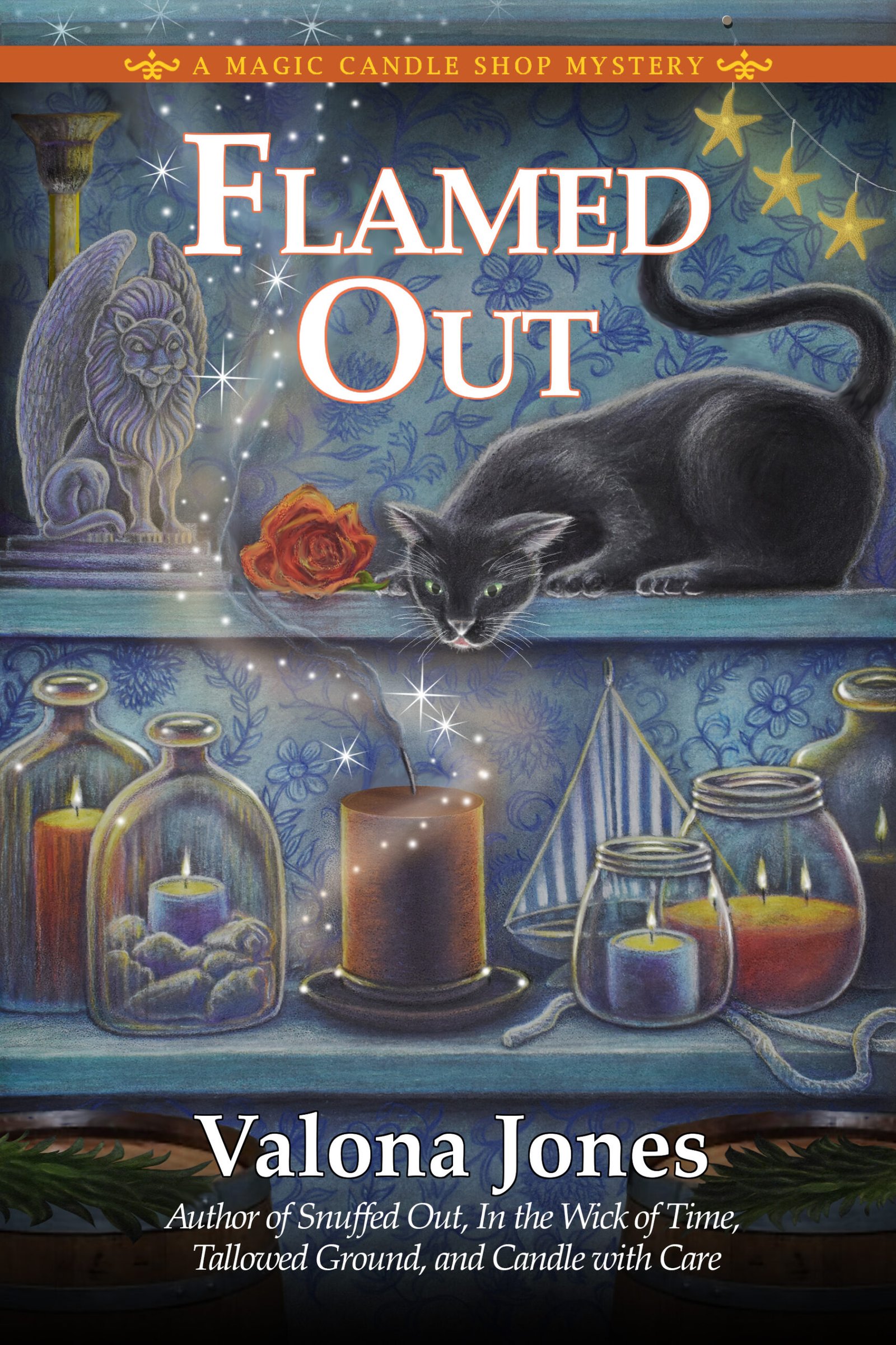
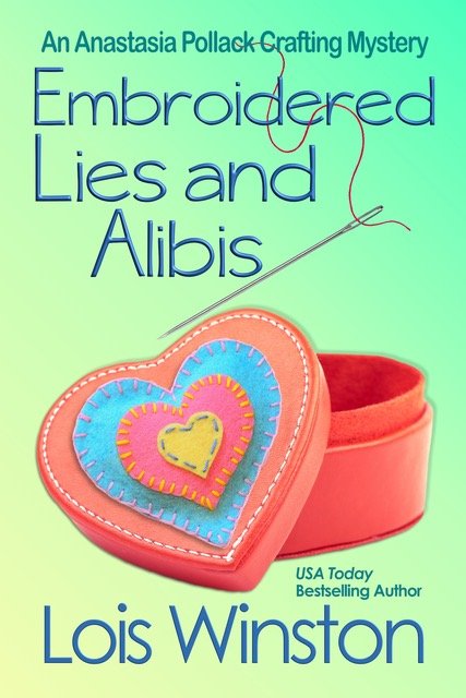
 One of the most exciting things with every book you publish is seeing your cover art for the first time. I’ve been incredibly fortunate in that, for many of my novels, I’ve been able to contribute ideas for the cover (they’re not always used, but I do get asked). Sometimes, I even get to see the artist’s concept sketch in advance so I can suggest changes before the scene is set in stone, er, ink. And I must admit that the greatest number of my book covers have been lovely pieces of art.
But not always
.
Most savvy readers are aware that we traditionally published authors rarely have the final say over our cover art. (Of course, I’m exempting James Patterson and J.K. Rowling and Stephen King and others who breathe that rarefied publishing air. They veto a cover, and it’s vetoed!) Instead, the cover design is a collaboration between the editor and marketing group and artist, sometimes with input from the author. Most times, the artist gets it right…but sometimes, they get it wrong. And usually by the time the author finds that out, it’s too late for her to do anything but gnash her teeth and pray the next book cover is better.
Of course, getting it waaaay wrong can actually boost an author’s profile. Just ask bestselling romance author Christina Dodd. Back in the 1990s, she learned that her just-released historical romance unfortunately featured on its cover a beautiful heroine who happened to have three arms. Yep, the art department fell asleep on the job and screwed up big-time on that one…and no one caught it until the book was already on the shelves! But Ms. Dodd savvily parlayed that hysterically awful mistake into a major marketing tool, and I suspect that her unanticipated notoriety lent a real boost to her career.
 I’ve never had any extra appendages show up on my book covers, but I’ve had a few things go wrong…some fixable, and some not. The first of my historical romances to have the traditional “clinch” cover featured a heroine whose auburn hair was mentioned quite frequently throughout the story. Unfortunately, I discovered when I received my author copies that the woman on the front was a blonde. Don’t get me wrong, it was a gorgeous cover, but that glaring error was noticed by many a reader.
 On a more fun note, the original “Hamlet the Cat” featured on my Black Cat Bookshop mysteries was first drawn as a cute fluffy kitty. I saw that and hurriedly reminded my editor that Hamlet was pretty much a bad boy feline. And so the artist obligingly added a bit of “snark” to Hamlet’s expression that captured him perfectly. My Tarot Cats mystery, Fool’s Moon, has my protagonist’s house on the cover. The artist got the style and color right, but for artistic purposes made it a single-story building instead of a two-story home as in the book. Sure enough, a couple of readers pointed that out. Fortunately, the two black cats on the cover are dead ringers for the kitties in the book.
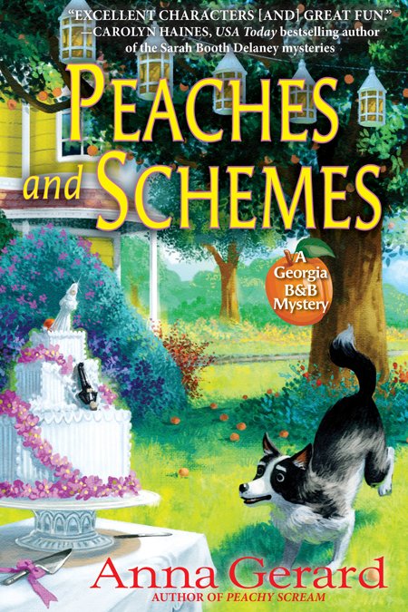
My most recent series, the Georgia B&B Mysteries, has a bit of a bobble on the covers, too. The books all feature the story’s resident Australian shepherd, Mattie, front and center, with the titular B&B in the background. The covers are fab, and the pup is cute as she can be…except that the artist made her a fluffy-tailed Border Collie instead of a bob-tailed Aussie. Oh, well.
So, have you ever seen something amusing or shocking or just plain wrong on a book cover?
Also, while you’re here, click over and check out our August Book Vault giveaway, which runs Aug 1-18. You could win the book of your choice from our vault! CLICK HERE
Posted in Let's Talk, with Diane A.S. Stuckart • Tags: BLB Discussion, Cover snafus, Diane A S Stuckart, Let's Talk, Under Cover Operator | 19 Comments


Suzanne Brockmann tells the story of her cover gone wrong, when her hero was supposed to be extremely handsome and the marketing department’s version was more like the Pillsbury dough boy.
As an indie author now, I am in control of my covers. The hardest lesson to learn is that covers are a marketing skill set, not an “author” skill set, and you have to trust others to know what’s best. A cover doesn’t always depict the book accurately, and a lot depends on genre. I’ve been redoing a lot of my covers to make sure they let readers know they’re romantic suspense. Apparently not everyone reads book descriptions!
Also, since the majority of my sales are the e-books, I think that can help if covers aren’t “matches” for the book, because they don’t show up the same way in an e-reader the way the cover is always front and center in a print book.
Very true about the skill set, Terry. I think most publishers are pretty good about branding series. There’s nothing worse than when the cover screams one thing, but your book is another. But it’s crazy that an artist for a romance publisher wouldn’t automatically make the hero on the cover drop-dead gorgeous. Maybe someone with an ax to grind against good looking men?
I am such a lucky author. I have input into my covers with my editor at Kensington and occasionally we have to make a little tweak, but mine have all been gorgeous. There is a little something funny with the cover of DOWN IN FLAMES. Can you tell the cover artist is British?
Ha ha, but I think you’re OK since the center stripes are white and not yellow, so it’s a one-way street. 🙂
I agree with Diane. I saw that and thought it was a one-way street!
I remember both the 3-armed heroine and the Pillsbury doughboy hero. Ugh! You’d think someone at the publishing houses would be on the ball about such things but apparently not. My second book, Love, Lies and a Double Shot of Deception, featured a cup of latte on the cover. The cover artist had added a bullet hole at the bottom of the cup with a bullet placed next to it. Only problem? The coffee would have been spewing out of the hole, but it magically stayed inside the cup. Luckily my editor caught the problem and had the artist remove the bullet hole and bullet. I wish they had come up with a way to show the bullet hole in the cup because aside from the physics problem, it really was a great cover and better conveyed that the book was romantic suspense. 🙁
LOL can you imagine if that cover had made it out into the world?
Other than a word wrong in the blurb (which was caught and changed..I hope), I’ve only had one funny experience. I had a great cover that immediately conveyed the University of Michigan setting from a small house for Maze in Blue, but when I sold the mass market rights, the bigger company made the cover a maze with dead bodies being the little lines that could be hit… when I asked about the play on the University’s colors that the title conveyed, the cover was modified —so, today, the big button in the idle one could hit with a pinball for extra points is a Wolverine head…not quite what I had in mind, but I had no say…
hmm, I’d like to see them side by side. I actually rather like the maze made up of bodies, LOL.
I love book covers and as a hybrid authors, I enjoying creating my own covers. As for publisher covers, I’ve been happy with all I ever had. I think I was so awed by the physical covers (and my name on them!) that I never put much thought into if it was a “selling” cover. I always trusted the publisher to know what was right. I may have a hair color mistake on my current cover but perhaps I changed it after I got the Dreamed It cover with the redhead on the front. But I have an out since there were multiple victims…
On the bright side, you can always blame the publisher if it’s a trad pubbed book, and you can fix it yourself if it’s an indie pubbed. 🙂
I’ve been fortunate with my covers. Five Star asked for my input, which was a good thing because they had an ocean view out the window in Hanging by a Hair, and the setting is nowhere near the beach. Wild Rose Press got my covers mostly like what I described on their art sheets. For Kensington, I was not involved except to proofread the cover copy. Now that I’m indie publishing, I have complete control, which makes author branding much easier.
LOL, Nancy, don’t you know that anywhere in Florida you can look out the window and there’s a beach??
My next Lady & Lady’s Maid cover shows Eva, the lady’s maid, dressed like a housemaid. So wrong!
I’m worried she’s going to be so mad she’ll quit the series, lol. But seriously, this surprised me because the artist had it right in all the other books so far. But too late to change it.
Ouch. And chances are your readers are pretty savvy about those sorts of things. Hope Eva doesn’t quit!!
I’ve been happy with all my covers from Kensington… even though the cat featured on some of them was supposed to be a solid gray Chartreux, and the artist added stripes! Oh well, it’s a small detail. 🙂
I’m wondering, though, has anyone revised their manuscript to match the cover art? I’ve done that more than once. For example, I didn’t originally envision the new age shop on the cover of Bell, Book, & Candlemas as having a second floor. But after seeing the cover, I started mentioning a second floor in the text! And when the artist added a gazebo in the background of the cover for Mayday Murder, I decided to insert a gazebo in the revised manuscript. Lol.
Hi Jennifer. When the artist actually put my suggested skull (Yorick from Hamlet) on top of the fountain for the cover of my Georgia B&B book coming out in 2020, I made sure that the skull showed up throughout the book, when I really hadn’t planned that before. 🙂 But, seriously, don’t the artists have the internet so they can look up pictures of various animal breeds?
I’ve been extremely fortunate that my publisher, Solstice, “gets” my vision for my Tough Luck world. I do have input in the cover art selection. I’m pleased they’ve given a preliminary Green Light for The Indigo Hour cover photo. A friend took the picture and gifted it to me for photo credit. Cover art is touchy because, as most of us know, a book IS judged by its cover in the real world.
How cool to have a talented friend to give you cover art!